National Independent Venue Association (NIVA)
Creating an app to support independent venues
Challenge
Solution
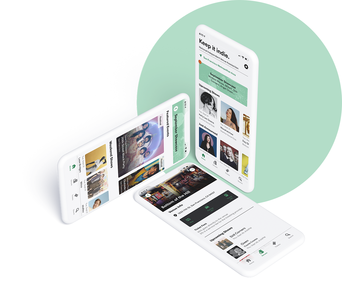
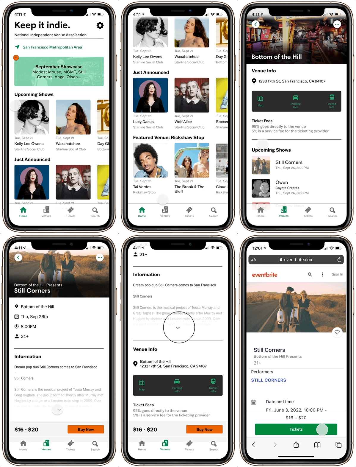
To meet NIVA’s customer’s needs, the presented solution is to create an app that features live music venues events that features a monthly recommendation list.
Role
Scope
Design a new app from an existing brand.
01 Empathize
Interviews + Survey
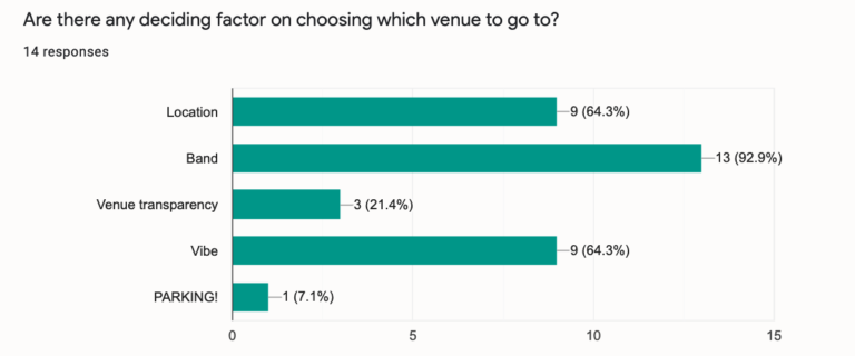
By conducting a survey and user interviews, I wanted to learn about people’s experience finding concerts and if they have had any prior interaction with NIVA.
By conducting a survey and user interviews, I wanted to learn about people’s experience finding concerts and if they have had any prior interaction with NIVA.
Some of my key findings were:
Music Venues
• People want to know more about the location including the parking and public transit information
• People wanted to gain better clarity about ticket fees
• Having concerts come to them rather than seek it out is important
NIVA
• Monthly check-in is the prime amount of time to check in with the app
• Event calendar is main info people want
• A highlight on individual venues
“More visibility on venues would be great. Sometimes I don’t even know a venue is there unless I know someone who plays at it.”
Findings
With my research, I was able to sum up the current user’s needs: NIVA users need a way to easily learn about shows every month while also finding more in-depth information about venues.
I believe that creating an app featuring live music venues and their events that highlights a monthly recommendation list will result in more support for NIVA and independent venues because we know that users want to know more information about venues while also having the shows come to them.

02 Define
Persona
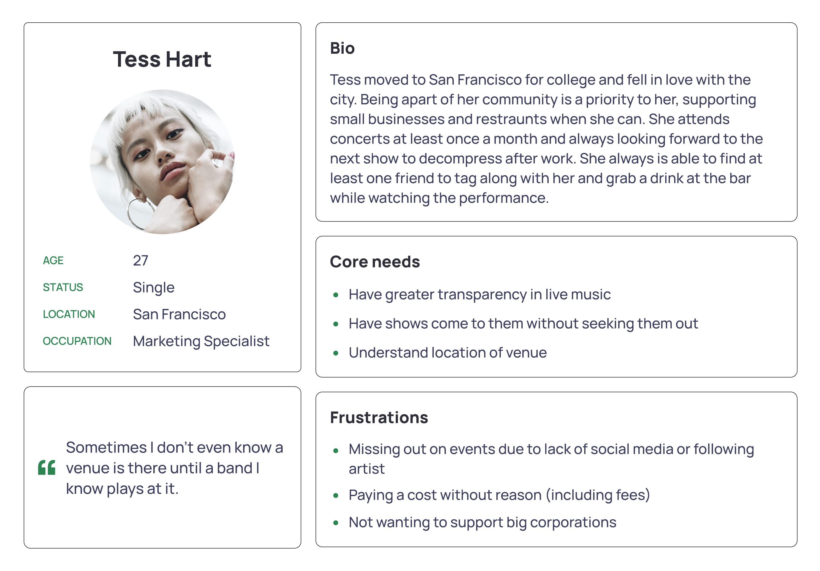
Having previous knowledge of the Bay Area music scene, I wanted to set my persona in San Francisco. This would help me creating the prototype and empathize more with my persona, Tess. Her core needs are based around finding events easier, understanding the venue, and a greater need for transparency.
Product Roadmap
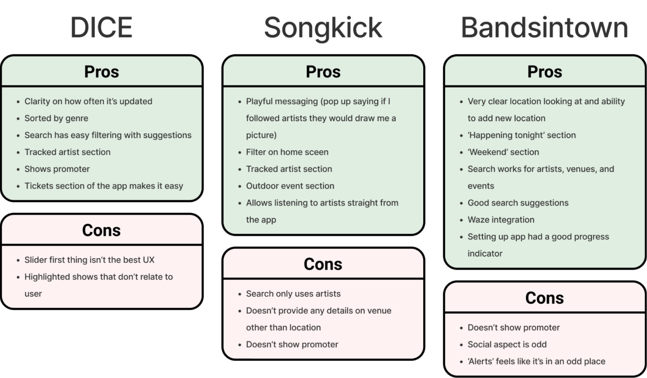
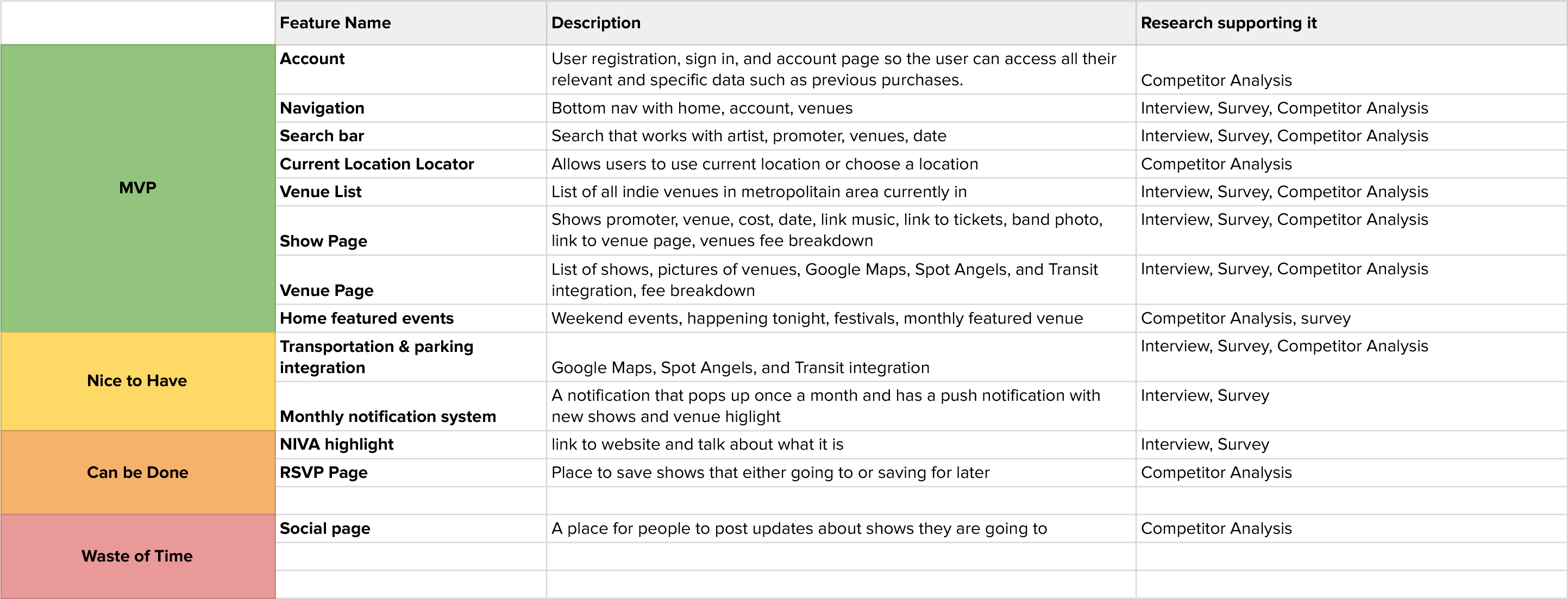
Looking again at the competitor analysis and research findings, I compiled the features the app needs from MVP to waste of time. One main feature that I decided to leave off was the social page which is present on Bandsintown. I couldn’t find any research supporting why that was included, so it will not be included in my design.
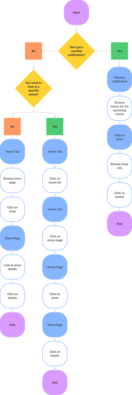
User Flow

03 Ideate
Sketches + Low Fidelity Wireframes
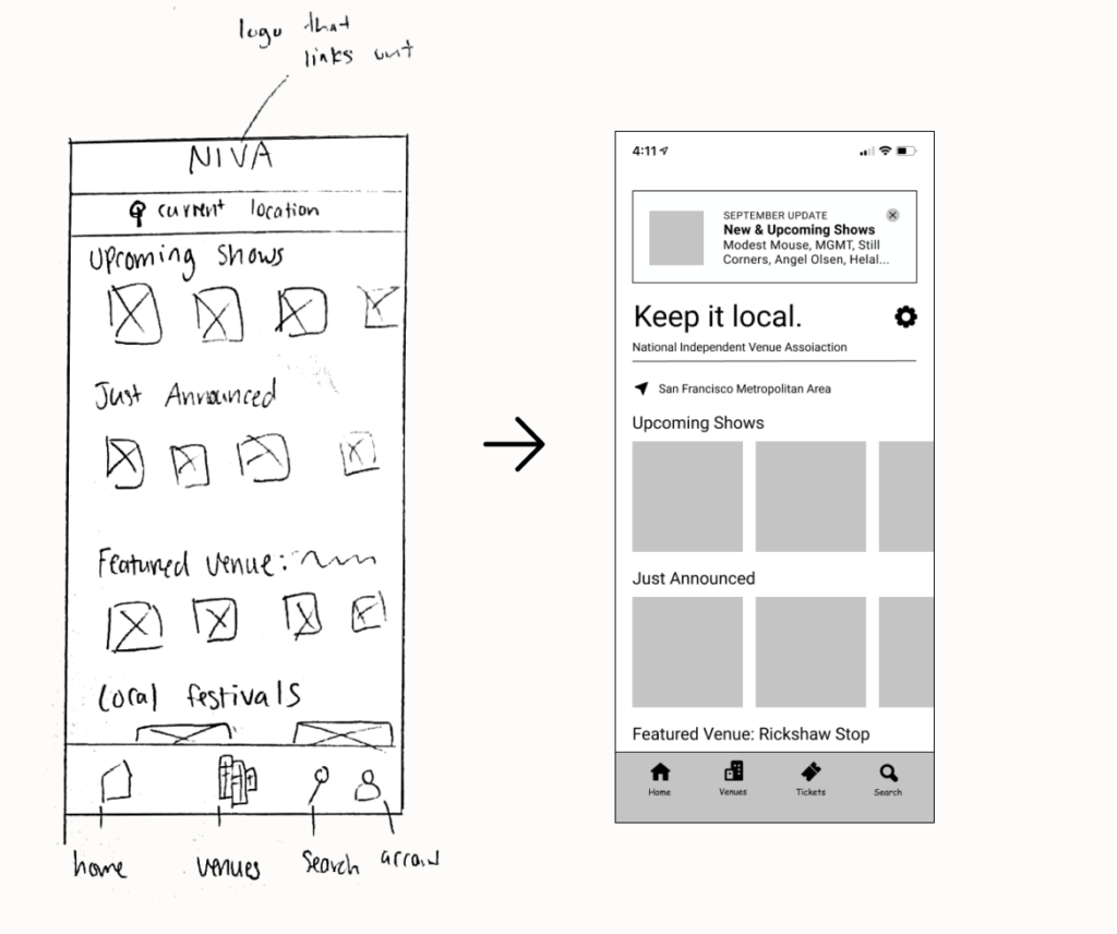
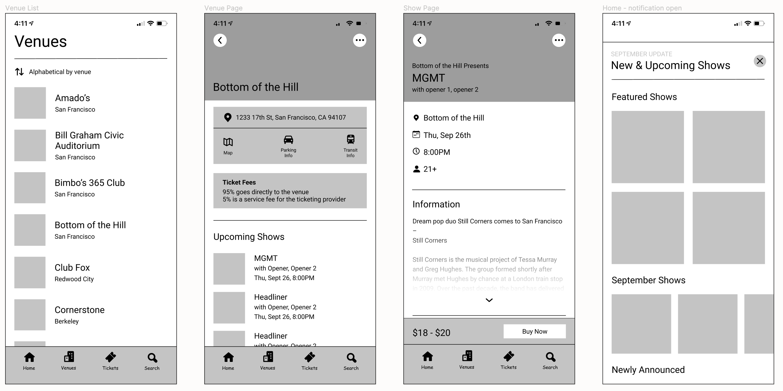
Thinking back to my user’s needs and doing some additional competitor analysis, I began outlining the most important things for the home page. I moved away from having the title be ‘NIVA’ to help users better understand that this app highlights independent venues only. The pattern I used for the monthly notification was based on something I have seen Apple use before.
While building out the individual pages, I had to think about what features were necessary compared to what would be nice to add. I wanted to make sure that I was addressing user needs first and foremost before adding features without research backing it. Something I knew I wanted to dig into more was the sorting option on the venue list page.
Low Fidelity Usability Testing
Testing fast and dirty is something I value a lot in my process. Before I got much further in the design, I wanted to see how my wireframes were coming along. One of the main things I took away from it was that the monthly notification looked like an ad that their eyes would skip over out of instinct. Not everyone understood this app was specifically for independent venues either.
“I know it’s low fidelity right now, but it looks like an ad“
<span data-metadata=""><span data-buffer="">Stylescape
While running my usability test, I took the time to create a stylescape for this project. NIVA had an existing logo and color scheme I was able to build on to create this. I adjusted the green from their original to help with accessibility standards and added the orange to create a bright call-to-action color.
UI Kit
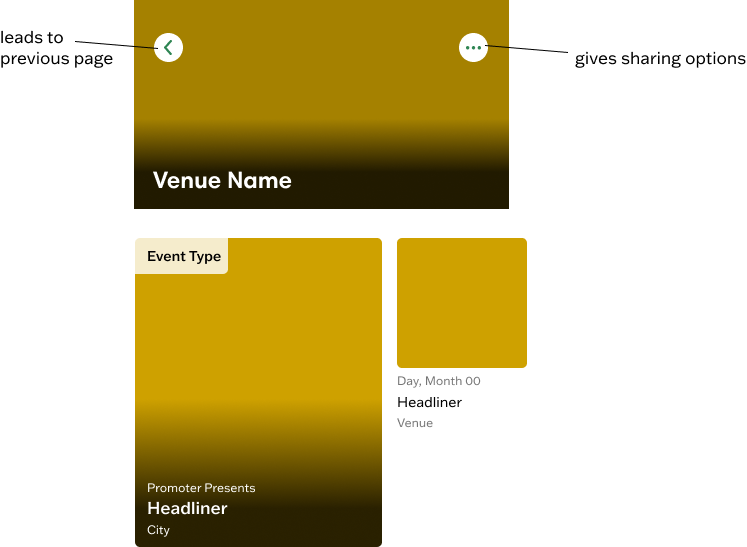
After typography, fonts, and colors were set on my stylescape, I wanted to create how the components would look on each page. Going back to my competitor analysis, I was able to find patterns that I could utilize in my design. I added the black gradient for the background of the venue name and headliner to make sure each name was accessible.

04 Prototype + Testing
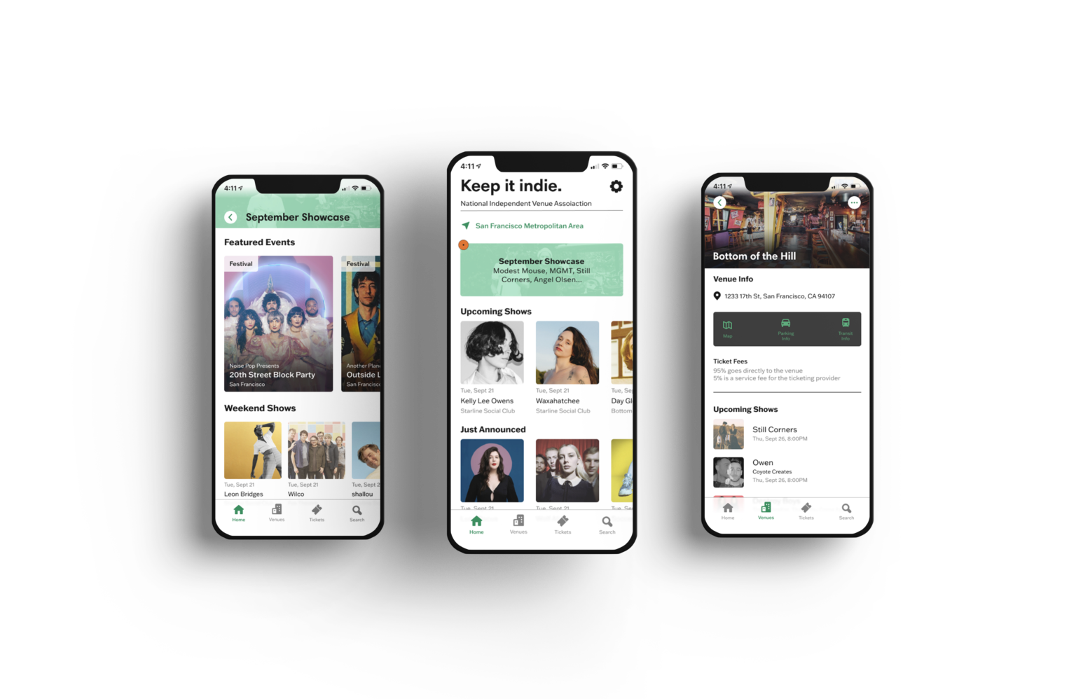
High Fidelity Design
Usability Testing
My test objectives were:
• Observe how users complete end-to-end task flows
• Task 1: Purchase a ticket from Still Corners playing at Bottom of the Hill
• Task 2: View and close the “September Showcase” on the home page
• Test if users understand the purpose of the app
• Test how users interact with the individual venue page
• Test how users interact with the monthly update
• Observe where users run into errors, issues, or confusion
The test was conducted with 11 people using Maze. All users have attended concerts at least twice a year (presently or pre-covid).
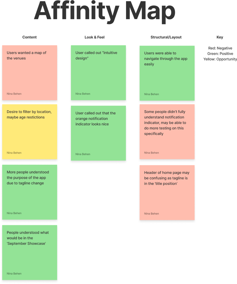
A majority of users were able to navigate the tasks and understand the purpose of the app. A fascinating suggestion that came up quite often was adding a map to show the venue’s locations. It wasn’t clear if users understood the orange circle to indicate that something needed to be viewed, but I think additional testing would help me understand that better.
Outcome
Next Steps
Do additional testing on notification
Not every user was able to clearly state what they believed the orange notification bubble stood for. I have a suspicion that this is due to the way I worded it. Testing how they interact with the home page with the bubble before they click vs. it being gone after they click might allow them to understand it through practice. If not, then I need to readjust my notification indicator.
Research what concert categories people want to see
The categories I created when grouping the concerts were full of assumptions. Some things were based on research, such as highlighting venues or weekend shows, but for the most part, I was stumped. I could do additional competitor analysis or, hypothetically, launch the app and begin to notice for patterns on which categories people click the most often,
Test parking & transit integration
Parking and transit came up during the research as something people found very important. I wasn’t able to test due to constraints in this mockup, but I would love the chance to see someone use a proper version. It would be ideal to test how often users interact with the feature.
What I Learned Along The Way
MVP vs Long term goals
Conceptualizing an app from the ground up, I had to think about the bare bones needed to make this a functioning app. I would love to expand upon the features people enjoy. It was a struggle to keep it only to what was needed, but it allowed me to begin to view how the app could grow months or years down the line.
Ask users what they were expecting
Something new I tried out during usability testing was to ask the user what they were expecting after a task was complete. If they expected to see exactly what they saw, I viewed that as clear UX writing or design. If they expected to see something they didn’t see, it gave me the perfect opportunity to consider why it wasn’t there and if it made sense to add. A map feature came up due to this question, and it wasn’t something I had thought of before.
Be okay with redoing high-fidelity tests to optimize
Working on remote usability tests is a blessing and a curse. I can gain more quantitative results of how my design is working, but it also highlights flaws in the wording of a question or conduct a test. This time I only used remote usability testing on Maze, but I need to start recruiting an original five people to test, learn where I can optimize the test, then create a new one. This would allow me to get the results I am looking for rather than just seeing the pitfalls in my wording.


