Apple Music
Adding a New Music Notification System
Challenge
Role
Solution
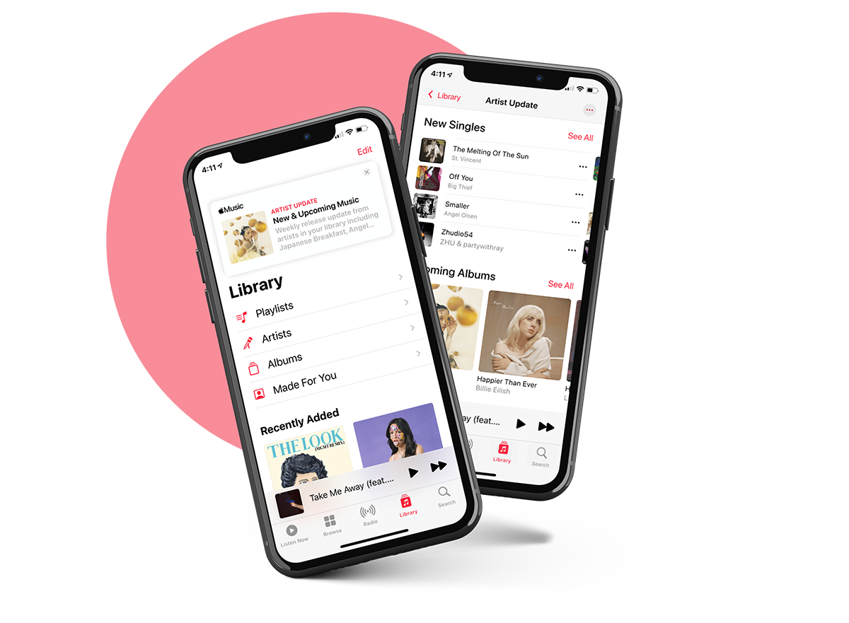
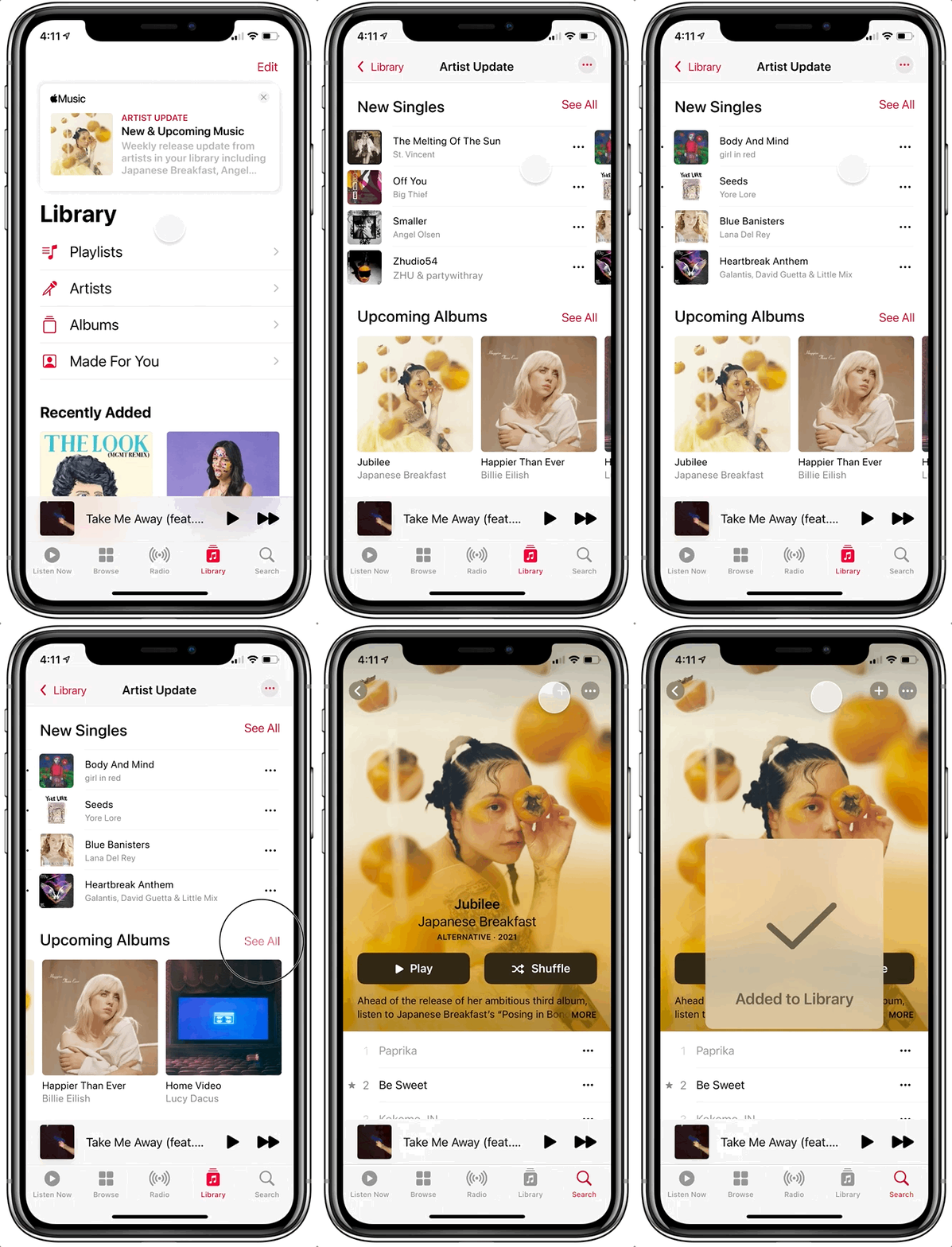
To help better meet their customer’s needs, the presented solution to Apple Music’s problem is creating a weekly notification within the ‘Library’ tab that shows the upcoming releases & new singles from artists in their library.
Scope
Design a new feature in an existing app.

01 Empathize
Research
With a survey and user interviews, I wanted to dig into what specifically people were struggling with in terms of new releases and pre-saves.
Some of my key findings were:
Upcoming Releases
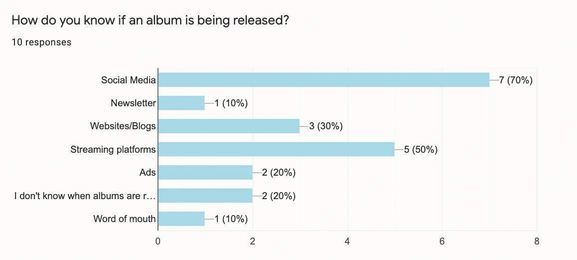
• Most people discover new releases on social media
• People called out that they want Apple Music to show them upcoming releases from artists in their library
• Keeping up with upcoming releases is important
Pre-Saves
• People who have used the pre-save feature overall enjoy it
• The one person who hasn’t heard of it said they wish they knew about it and that it would be more widely known
“I just have to search for new music. I wish Apple Music would tell me. It’s a surprise when I find something new and I’m shocked it’s been out for a year. Sometimes I’m on a newsletter for specific bands or promoters. I don’t love that I have to dig for it. Apple Music should know what I listen to the most and tell me if there is a new album. I’m on the app enough.”
Findings
With the findings I was able to sum up the current user need: Apple Music users need a way to easily learn about the upcoming and new music from artists they listen to, so they can feel connected to their favorite bands and musical trends.
I believe that creating a weekly notification within the ‘Library’ tab that shows the upcoming releases & new singles from artists in their library will increase album pre-saves because we know that users are learning about upcoming releases from social media or miss new releases altogether.

02 Define
Persona
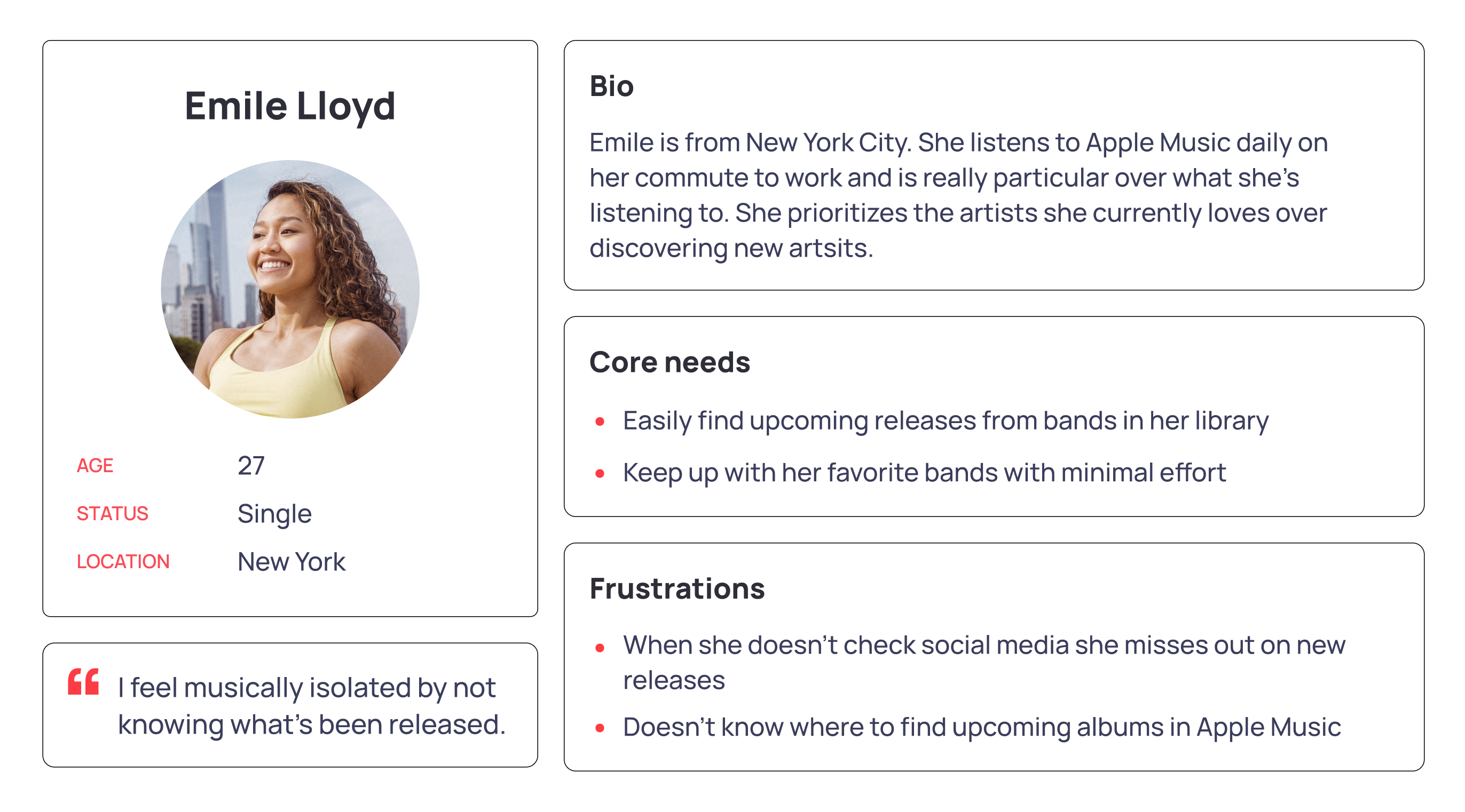
While looking at my research and summation of my findings, I created my persona, Emile. I wanted this persona to be more concise as she is the ideal user for the new feature. Her core needs to be finding upcoming releases while using minimal effort to help guide where I wanted to take this feature.
Sketches
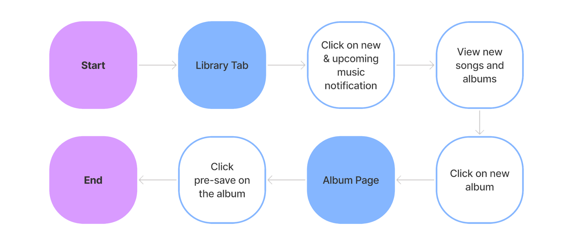
Task Flow

03 Ideate
Wireframes
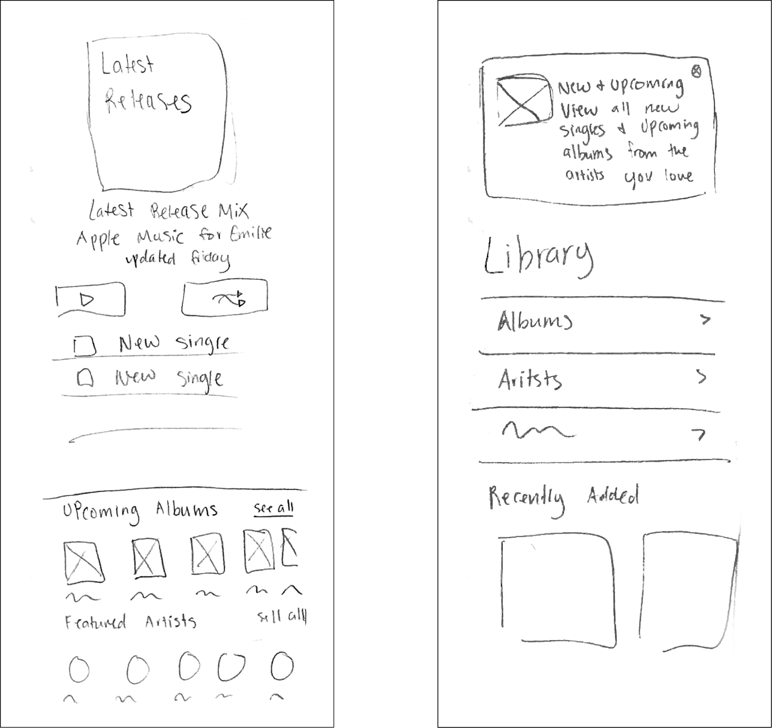
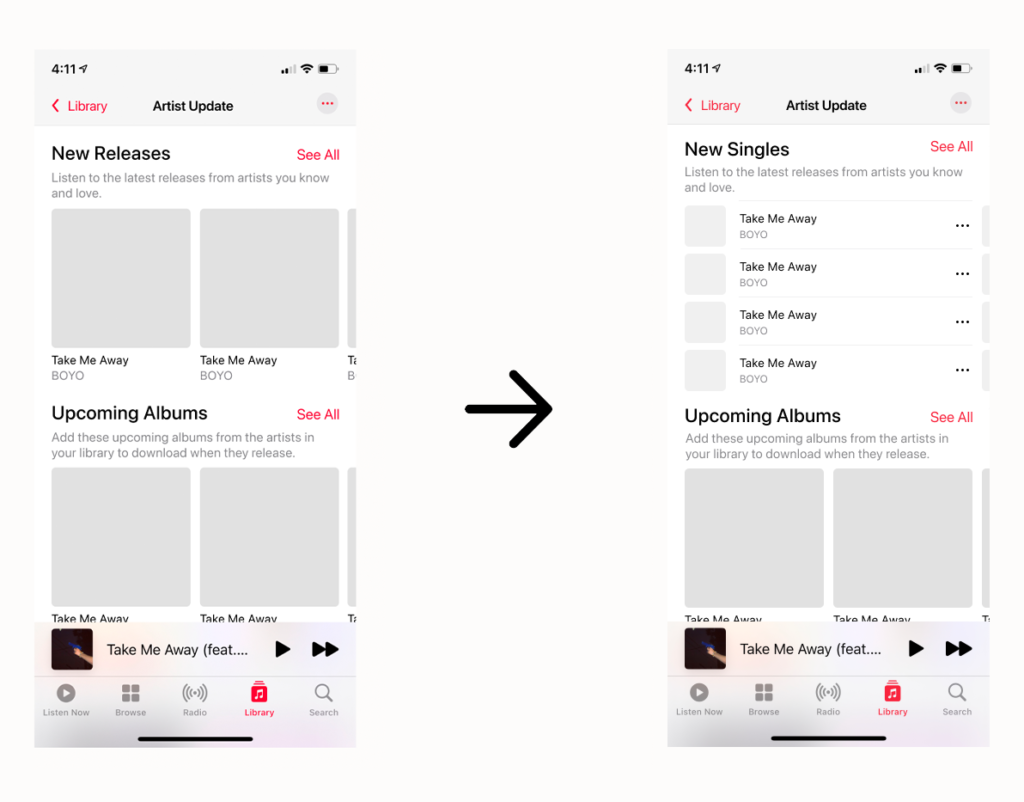
I began by mocking up the screen I sketched out and the first frame of the ‘artist update’. I didn’t want this to live as a new playlist with songs people could add, but rather an interactive highlight reel of the new music from artists already in their library. My first pass at this page was rough, I wanted to include singles but felt the usual pattern of displaying music took up a lot of space. After going back into Apple Music, I found a pattern of displaying singles I was able to incorporate.
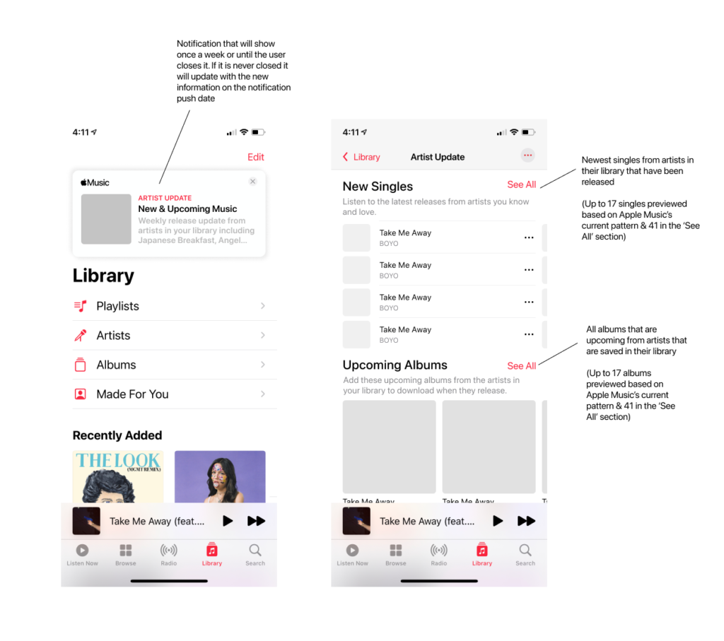
Once the artist update page was complete, I went in and created a very similar page to my sketch for the notification system on the home page. The styling of the page was based entirely on existing Apple Music patterns.

04 Prototype + Testing
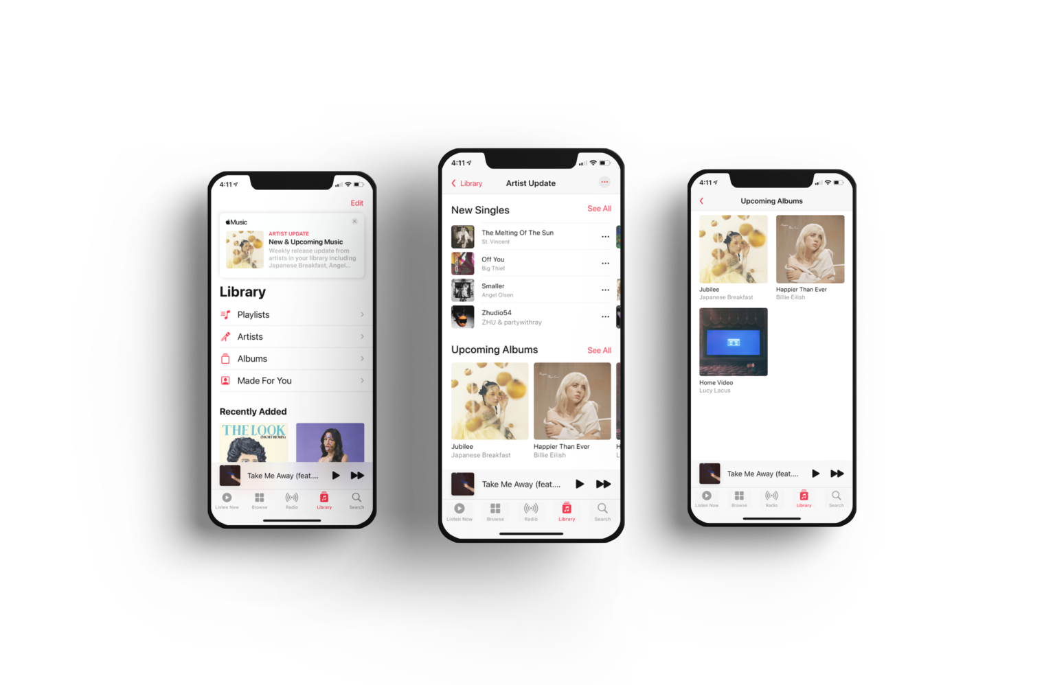
High Fidelity Design
Usability Testing
I had three main tasks I wanted to test:
1. If they could add an upcoming album to their library by using the new feature
2. If they could turn on and off the ‘artist update’ notification
3. If they could close the notification
The test was conducted over Zoom using the prototype or Maze. All users use Apple Music as their primary streaming service, so I could know that they were already familiar with the ecosystem.
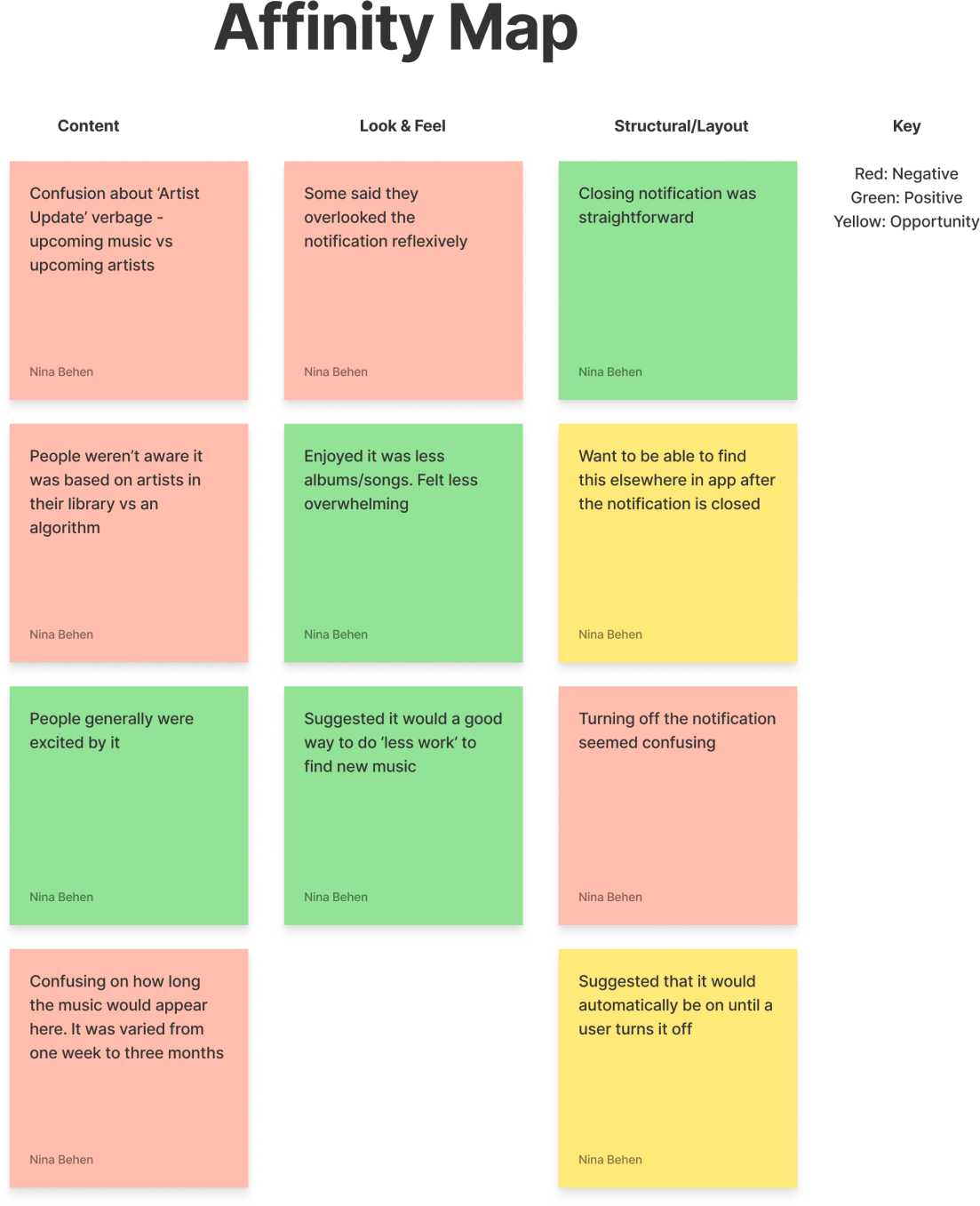
Usability testing was a success! Overall most users seemed excited about the feature and indicated they would like to use it themselves. The largest area I found that improvement was needed was my UX writing. An area I learned personally I needed to work on was also wording in my usability test. When trying to learn if the user could turn on or off the notification system, almost all users were confused by the task. I learned when it comes to wording, I should find either a test user to learn from, or talk to a teammate about my tasks and see if they can understand them.
Outcome
Next Steps
This project was exciting to me as a frequent Apple Music user. There are some things I could continue to work on, and some things I wish I could work on given the opportunity,
Add Additional Explanation
Earlier on, I had considered adding some text into the ‘artist update’ to add clarity to each section. I have a hunch that adding that into the next version of a usability test will allow users to understand more clearly what the feature does.
Test With Updated Language
Similar to my point above, leaning into UX writing to make everything more clear is a must. I had assumed that the phrase ‘new & upcoming music’ would be clearly understood as new music and upcoming music. I had learned a user interpreted this being varied with ‘artist update’ as ‘music from up and coming artists’. Testing more verbiage is crucial to getting the user experience to be in line with the goals of the feature.
Hypothetical: Long Term Results
Ideally, I would be able to beta test this will a small percentage of Apple Music users over a long period of time. I would measure long-term results by an increase in user’s reporting they primarily learn about music on Apple Music & if more albums are pre-saved. Though this is not something I can test myself, throughout the project I wanted to think about long-term success goals from this feature.
What I Learned Along The Way
UX Writing
Oh man, I underestimated the value of good UX writing in this. A lot of confusion in my testing came from users not fully understanding what music was being highlighted, how recent the music being displayed was, and confusion over the term ‘artist update’. Though I have personally only scratched the surface on what makes good UX writing, these are things I could continue to test with users until I find wording that gets across exactly what the feature does as easily as possible.
Designing For Joy
When doing my research, I began to wonder if the feature was solving a real problem. Users still used the app daily, is this a feature they need? Reframing it as bringing joy into their app experience helped me understand the user more and empathize with the users.
Short Term Vs Long Term Testing
Similar to what I talked about in my next steps, I need to consider both short-term usability and also measuring success over time. A feature isn’t successful as long as users know how to navigate that. Doing testing down the line to see if their needs are being met with the design is just as important.


