Rasputin Music
Responsive Website for a Record Store
Challenge
Solution
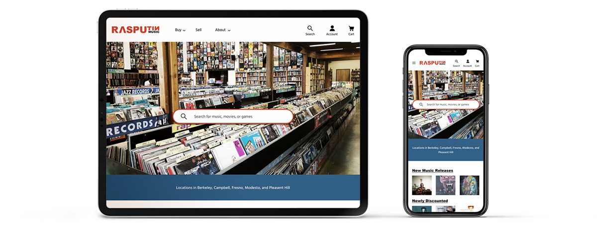
To help better meet their customer’s needs, the presented solution to Rasputin’s problem is to build an e-commerce website where they can sell all their products with a highlight on searching and browsing as learned from user research.
Role
Scope
Design a responsive e-commerce website with updated branding

01 Empathize
Research
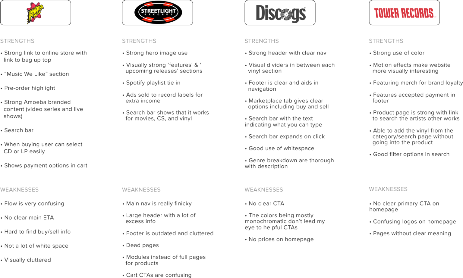
After delving into the problem, I created a research plan to learn more about Rasputin and the record store industry. This includes user interviews, user survey, competitor analysis, and market trends.
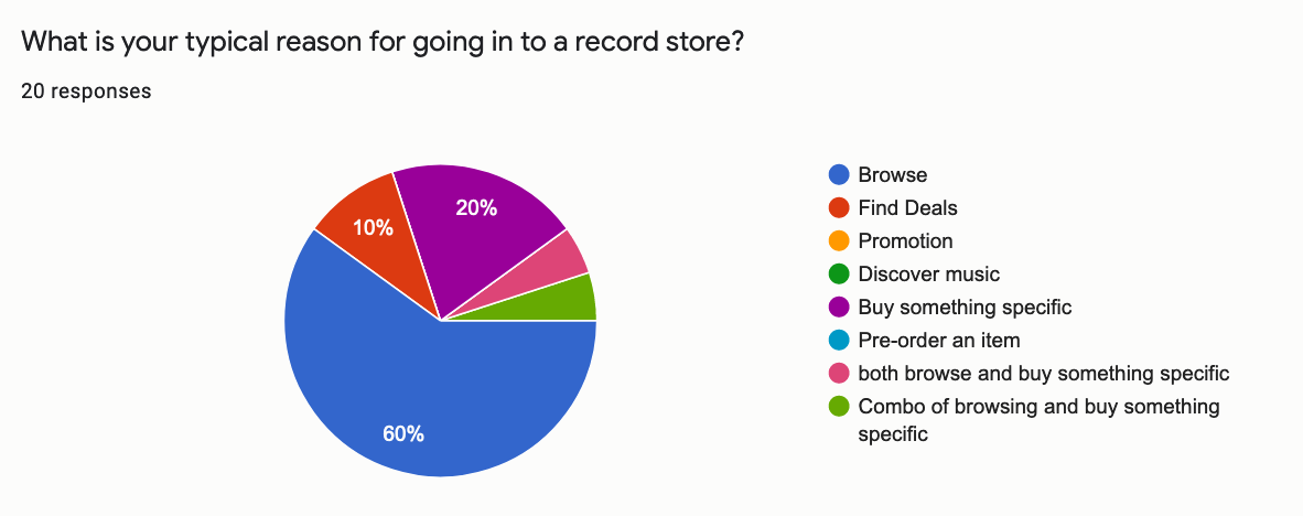
For the survey and interviews, I wanted to learn the pain points when purchasing items from a record store, why people shop for records in-store and online, learn why users go back to the same record store and learn about their experience selling used records.
Findings
After my initial research, I began to worry I didn’t ask people the most basic question. What is the goal when people go to a record store’s website? I went back to some interviewees that indicated they would be willing to answer follow-up questions and found that the main reason was that people wanted to shop for music. One person indicated that it was to find out information about their store and hours. I wasn’t able to find enough participants who have sold used records in the time frame for this project, so learning more about that experience would have to go in a future iteration.
Some key findings I found were:
• Vinyl is the most popular item
• People enjoy buying albums they haven’t listened to before
• Enjoy large selections
• People don’t keep up with Rasputin on social media or their newsletters.
• People shop for records online to find something specific but still enjoy browsing.
From this research, I got some ideas of what my website should and shouldn’t have. Good browsing is essential, but the search bar is the most important item. Since people don’t stay up to date with Rasputin, the newsletter wouldn’t be featured on the website and the social media would exist in the footer only.

02 Define
Persona
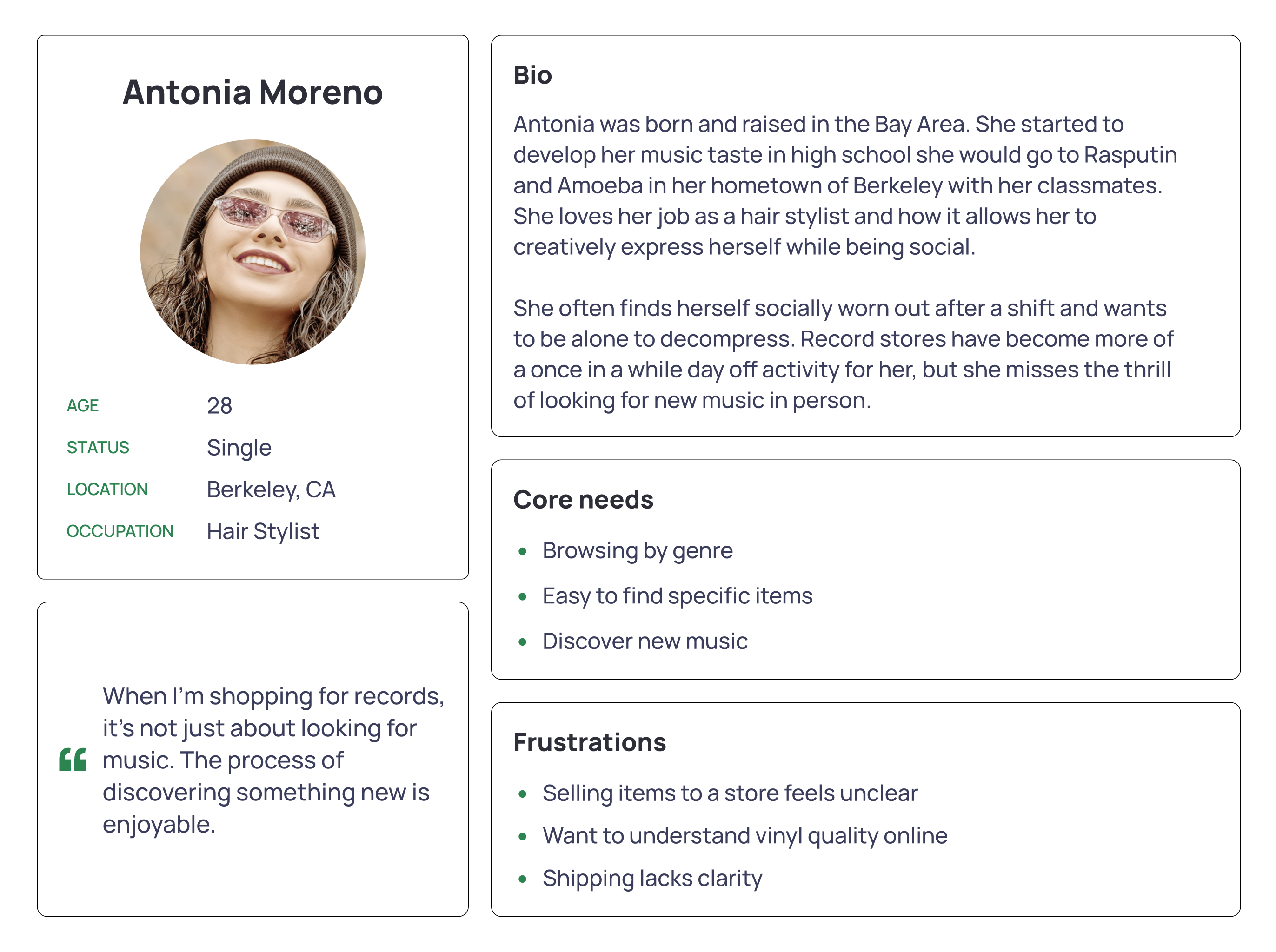
After analyzing my research, Antonia my persona was born! She loves large selections of vinyl that she’s able to browse by genre. Discovering new music is a hobby, but she also wants to find that one specific record easily. Some of her motivations to shop online are finding deals and avoid interaction. I find personas to be incredibly helpful through my process to keep making sure I am not going based on assumptions. Antonia’s needs, frustrations, and motivations are what lead my design throughout the process.
Feature Roadmap
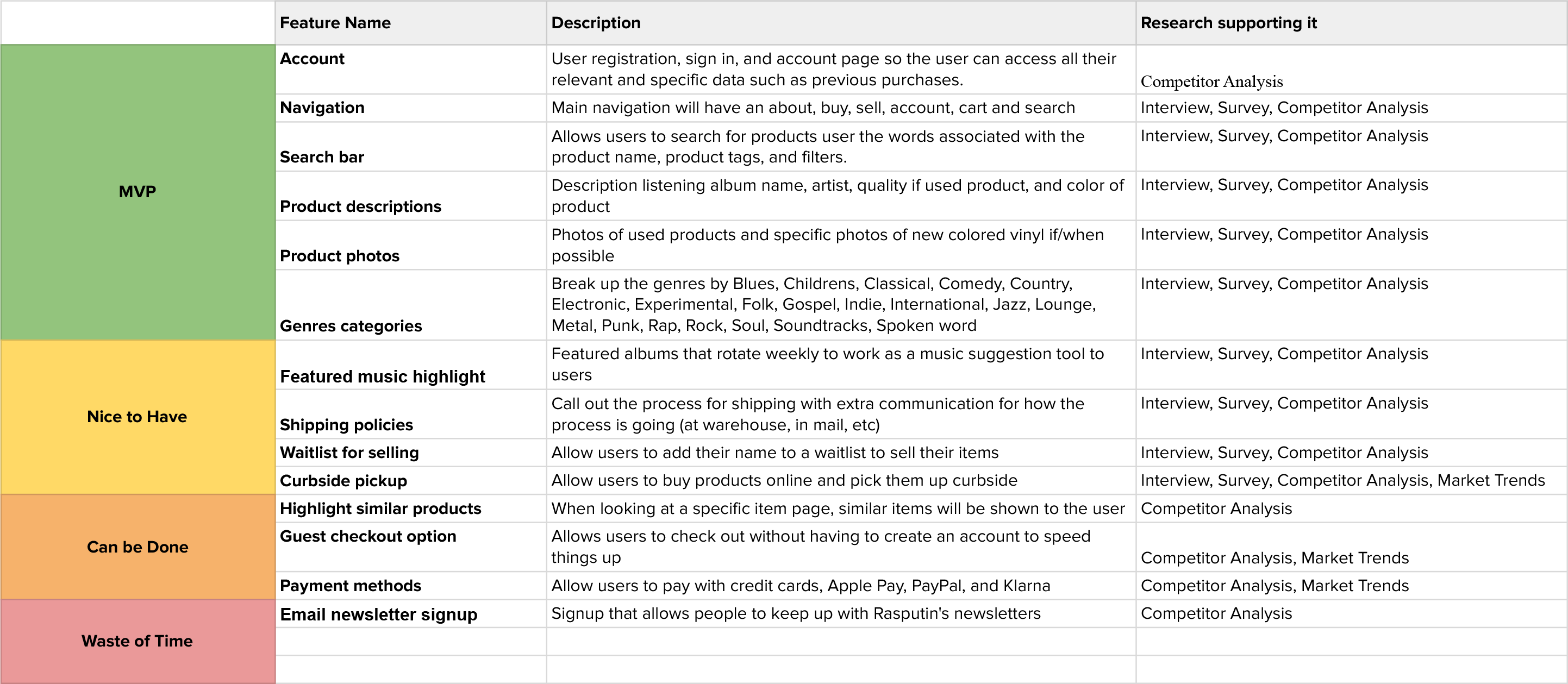
Looking again at the competitor analysis and research findings, I compiled the features the app needs from MVP to waste of time. A majority of the features in the ‘can be done’ section were defined by if they had very little research supporting it. These features could be implemented in a later iteration of the website if deemed valuable from additional research. I had no real evidence for including an email newsletter, so it was also left off for the initial version.
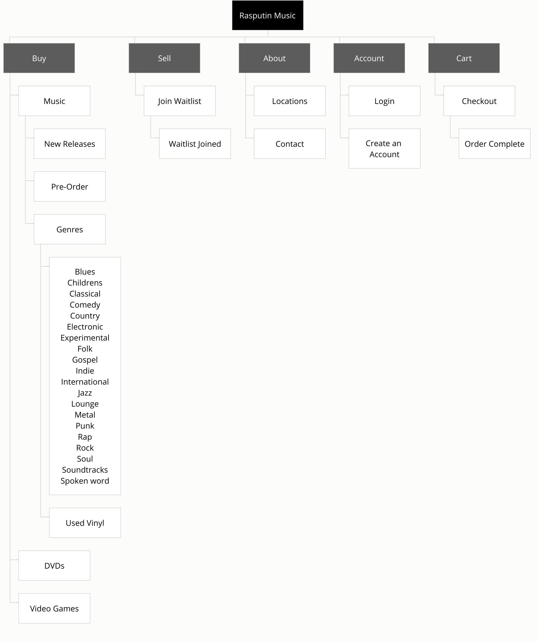
Site Map
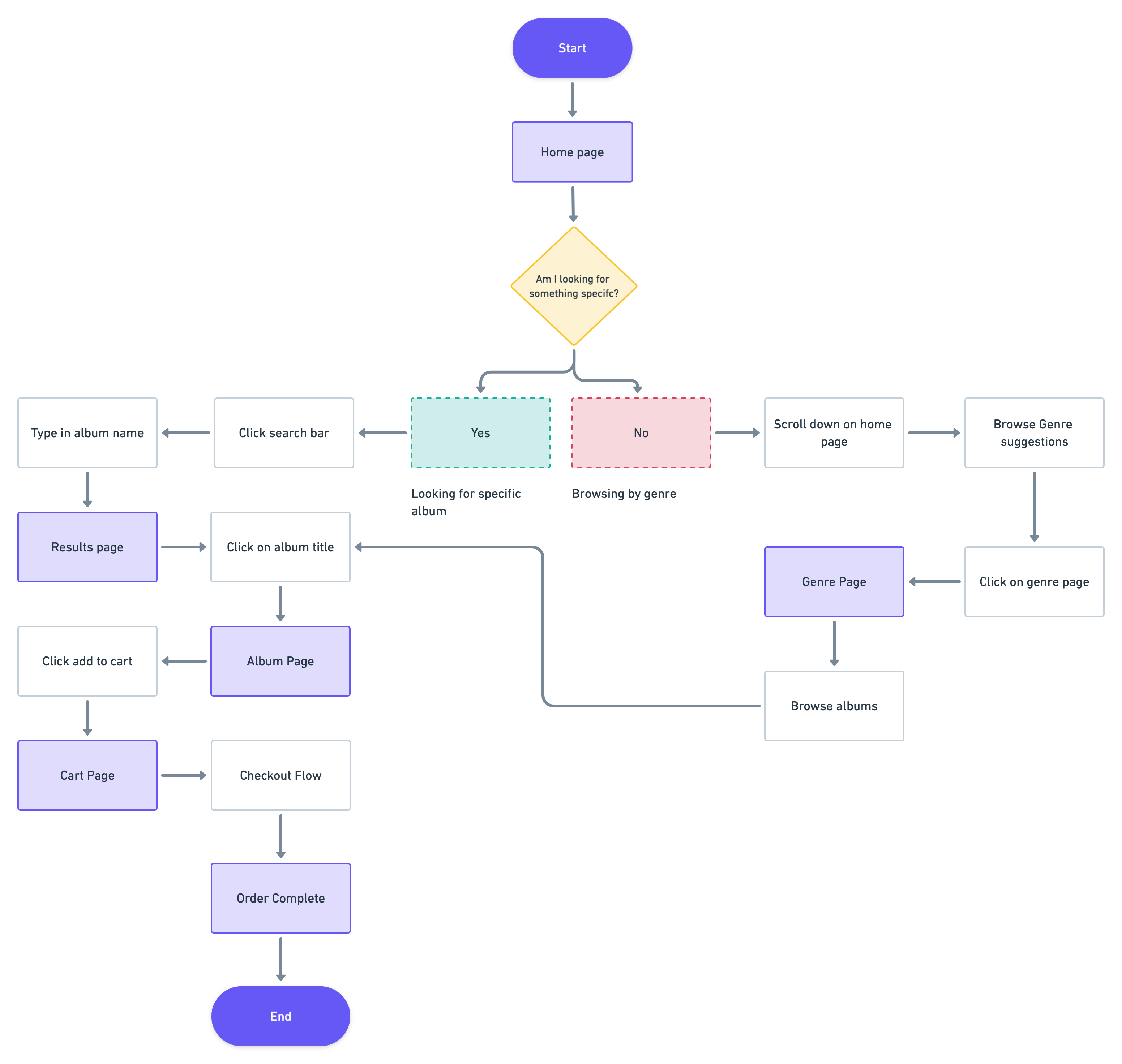
User Flow

03 Ideate
Sketches
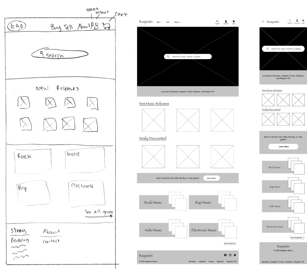
I am a big fan of letting the creative juices flow by sketching. I folded a piece of paper into thirds and began coming up with ideas based on both competitor analysis and my persona. I wanted to make sure as many of my user’s needs were met on the home page as possible. Having a prominent search bar, genre browsing, and features for new releases all were key from the research I had conducted.
Wireframes
Bringing my sketch into Figma always brings me joy. I looked back at my persona again and realized good deals were a key part of the record store experience, so I added that beneath the new releases section. Though I wasn’t able to finalize my research on selling records, it is a big part of Rasputin’s business model. This led me to create a small banner for selling. In a similar vein, I wanted to acknowledge that users come to this website for information about their physical stores. A direct quote from a user interview was, “what locations of theirs are open still?”
Low Fidelity User Testing
It was time for me to take the phrase “test early and often” into action. I had users go through three tasks: search for a specific item, complete the checkout flow, and browse for an item. After building these out, I used Maze to send out my early prototype. I wanted to make sure that users could navigate my site regardless of color and branding and catch frustrations early on.
Some key things I learned were: add to cart was unclear, alphabetical order for the genres felt unnatural, the buttons differentiating between CD & vinyl were unclear. I also learned how to use Maze more effectively on mobile prototypes from this user test as my original prototype appeared too small the people to read or see anything clearly.
I went back to my competitor analysis to create an ultimate genre order instead of alphabetical and discussed with fellow designers how to differentiate the buttons without relying on color.
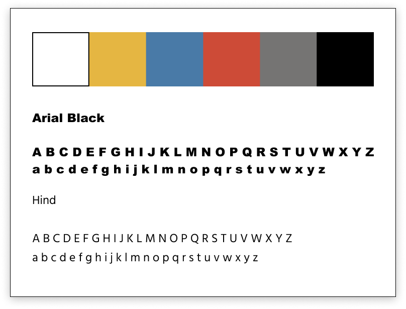
Branding & Logo

04 Prototype + Testing
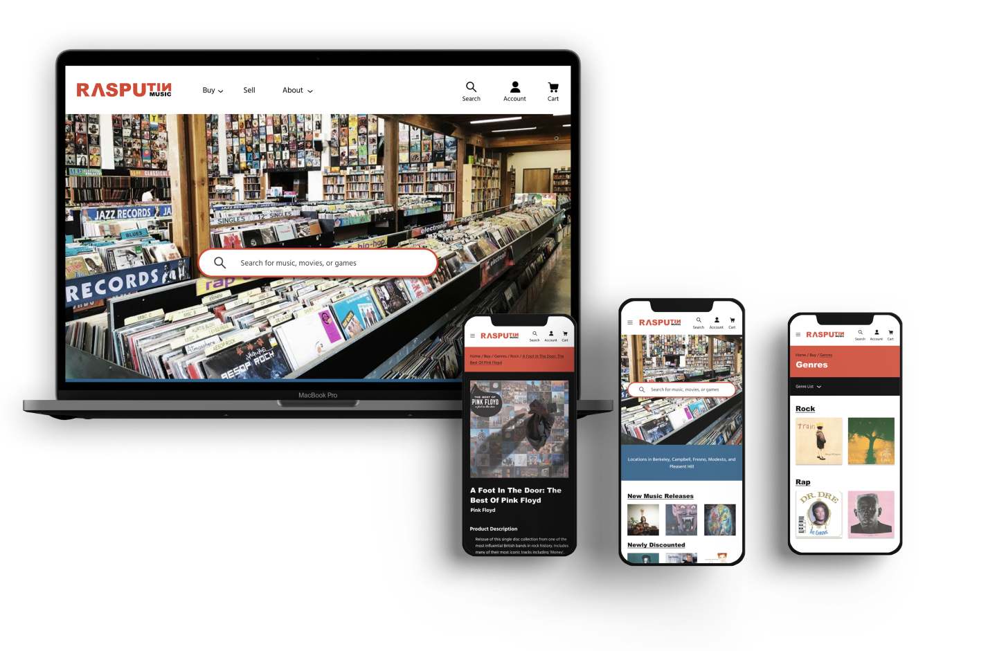
High Fidelity Design
Usability Testing
Having done testing early on, I translated a lot of the same tasks and questions from my last test. I wanted to see if there was an improvement in user’s experience from the early usability testing I had done.
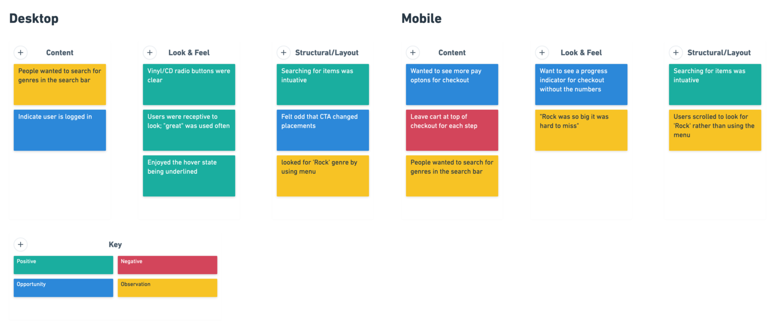
To my surprise, the overall results came back much more positive! As outlined in the affinity map below, people generally had a very intuitive time using the prototype. One user even said, “ [it] so easy, I didn’t even really have to focus on what I was doing.”
There of course is room for improvement. People came back with suggestions and areas they weren’t fond of which I made note of and want to delve into more.
Outcome
Next Steps
There is so much more I would love to do within this project! Along the way, there were items I felt like I began to scratch the surface of, but didn’t delve fully into it.
Selling experience
I would want to learn more about the selling experience in record stores. I have an assumption that making appointments similar to a waitlist you join at a restaurant would improve the user’s experience, but didn’t have any research to support that. I would want to observe a customer in action selling to a record store to learn more about their pain points without trying to come up with a solution to a problem that doesn’t exist.
Curbside pickup
From my market trends research, I learned that during the pandemic curbside pickup took off for record stores in particular. It was a tangible way to support your local store while social distancing. I began researching how my users used this service but couldn’t get enough data about their usage with local stores or record stores. This particular area will be interesting to dive into both now and when the pandemic begins to calm down more.
Checkout progress indicator
In my last usability testing, someone indicated that the progress indicator felt cluttered to them on the mobile prototype. I would love to do a proper A/B test to see if that increases the rate users complete checkout or if it is more of an aesthetic choice.
What I Learned Along The Way
Sometimes you haven’t done enough research
When I began my define phase, I felt I hadn’t done some of the most important research for this project. Going back to do additional user research allowed me to understand the user’s goals better. Sometimes you have to scratch the surface with your original research to realize where the real meat of the data is.
Testing fast and often
I have heard this phrase before, but I did not expect it to make as big of an impact as I did on my process. It sped up my prototyping down the line when it came to working in high fidelity and nipped a lot of the issues in the bud. It also allowed to properly test the usability of the site without color which is essential for accessibility.
There is always more to learn
The last project I worked on was also an e-commerce website. I felt as though it would speed this project up and streamline the checkout process. My experience helped identity patterns and speed up the process, but this did not mean I had it perfected. I feel as though going through another e-commerce site helped me continue to identify user’s pain points within the process.


