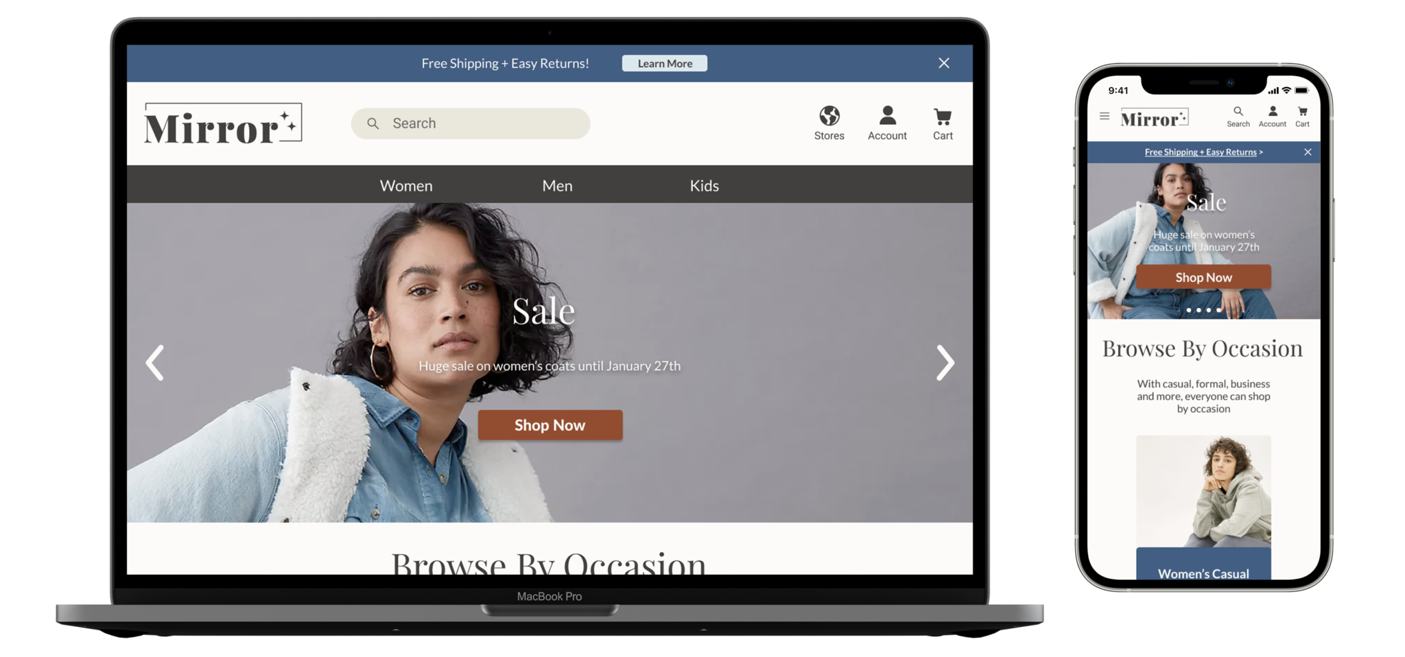
Mirror
E-Commerce Site for a Clothing Retailer
Challenge
Solution
To help better meet their customers needs, the presented solution to Mirror’s problem is to build an e-commerce website where they can sell all their products with a with a focus on filtering, searching, and browsing.
Role
Scope
Design a responsive e-commerce website and branding within six weeks

01 Empathize
Research
Based on interviews, competitor analysis, market trends, I was able to distill what direction the clothing industry was moving and find pain points within user’s needs.
Competitor analysis was based on brands that fit the same demographic or brand goals as Mirror.Three people were interviewed who were in the 18-50 year old range, both male and female, and who have shopped online in the six months.

Findings
The research revealed a particular highlight on deals, clear shipping/return policies, sizing, and importance of the search bar. Interviews provided to be particularly insightful and the competitor analysis and market trends were used to validate the learning from the user interviews.

02 Define
Site Map
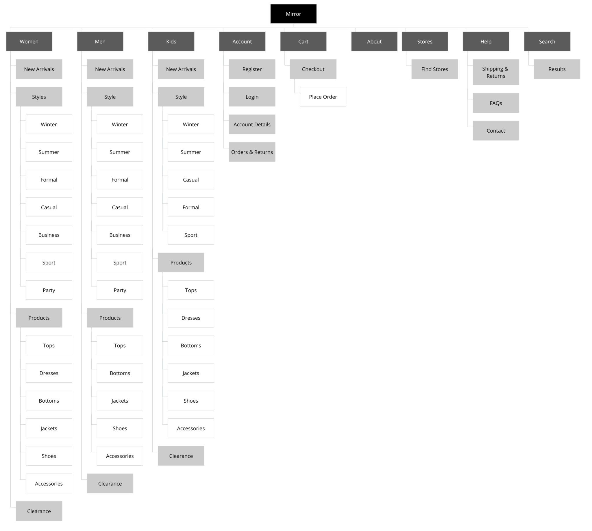
A card sort was conducted to find ways user categorize and name different groups of clothing items. I was able to conduct a remote card sort with five different participants. Two of the participants sorted the items based on season/temperature while the other three broke them into product types. The results of the card sort informed the product category names on my site map both in the product category and in styles.
Persona
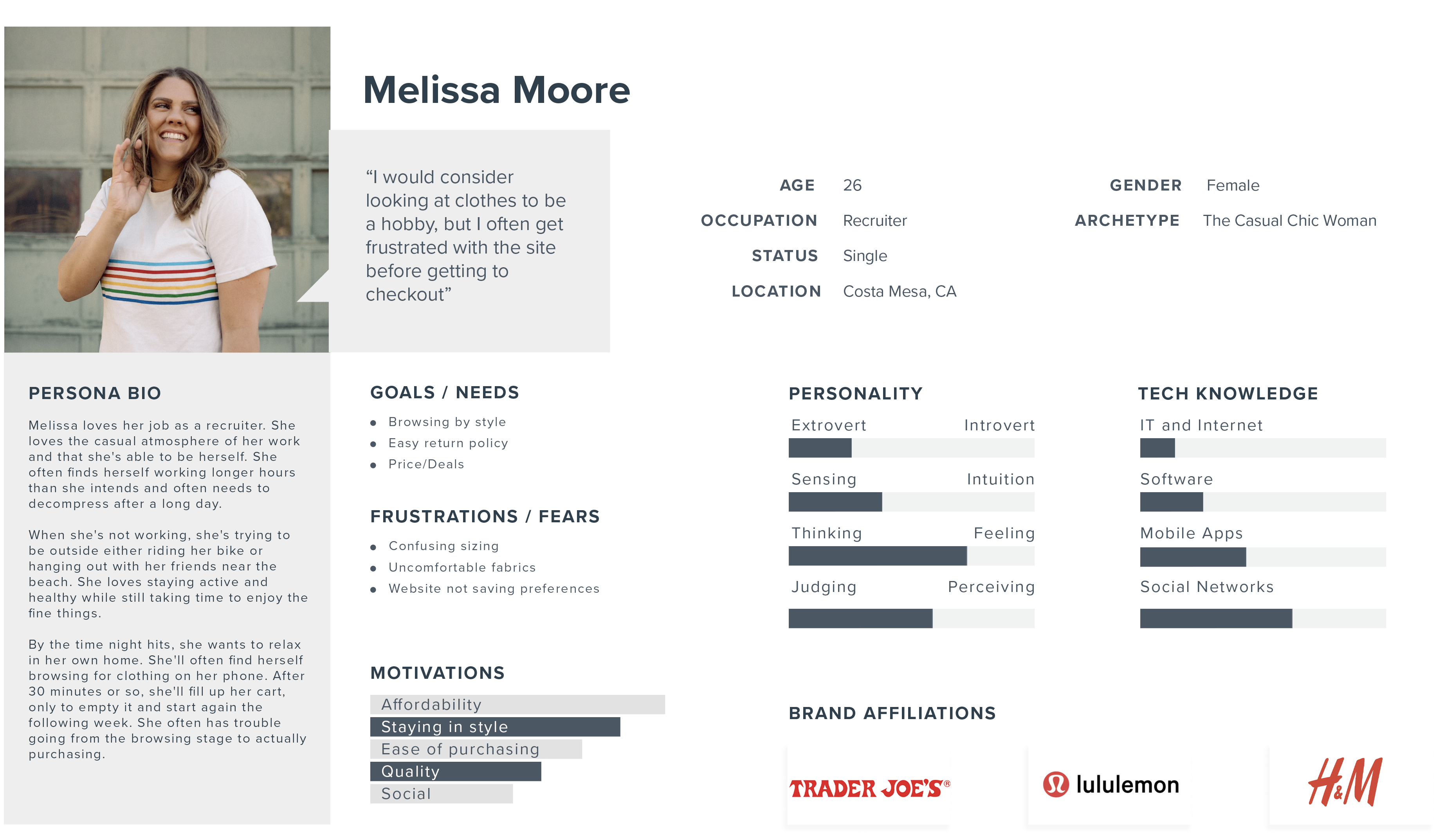
The persona, Melissa, was created after synthesizing the research data. Her desire for good deals, easy returns and frustration with sizing and the feeling of fabrics were key items that helped me keep the user in mind throughout the design process.
Task Flow

03 Ideate
Sketches
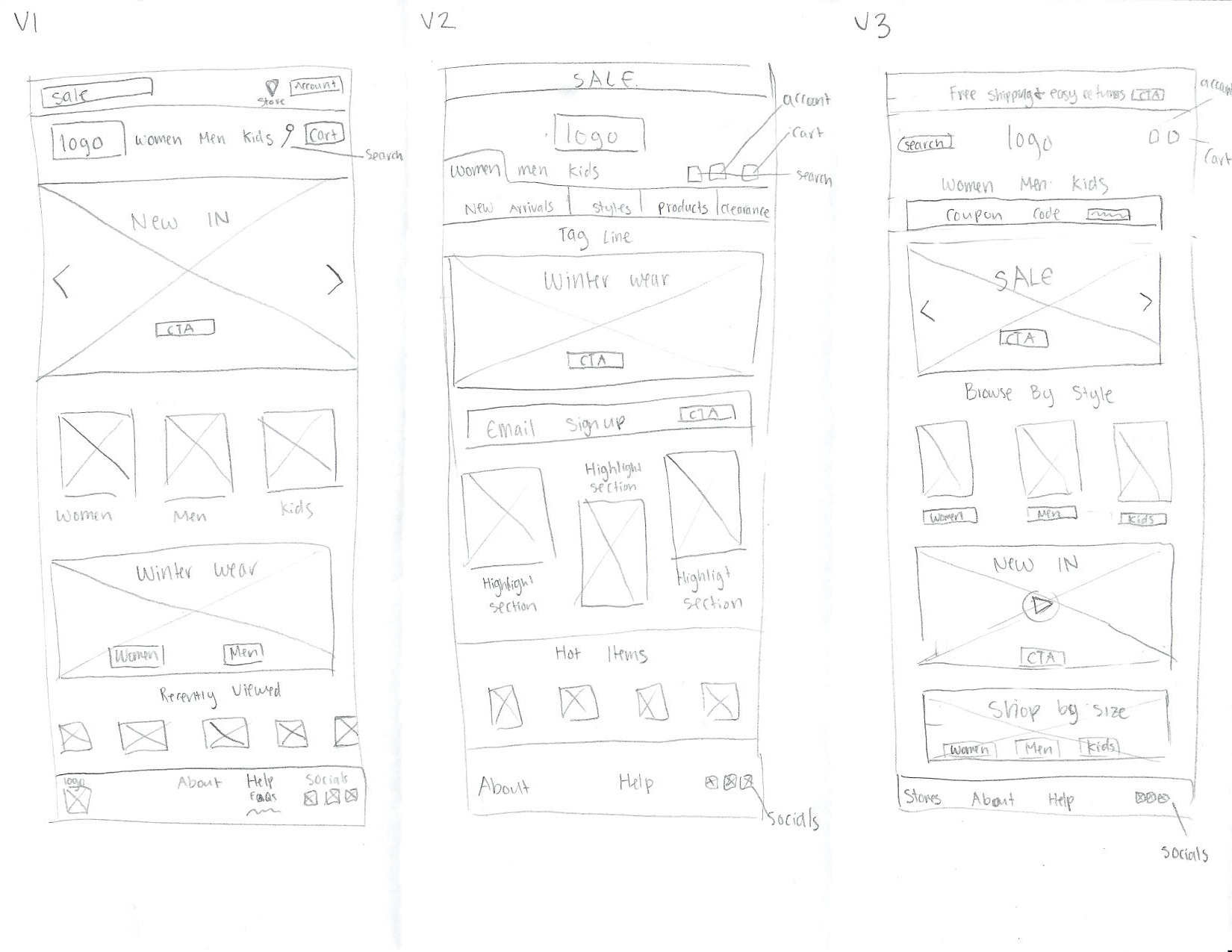
When sketching the first two versions of the homepage, it was heavily based on competitor analysis to get the ideas flowing. By the time I got to the third sketch, I realized I was forgetting my users. I began to implement some of the needs of my persona. Having the top banner highlight the shipping & returns and the bottom sizing section were some of the ways I began to incorporate the user’s needs.
Wireframes
When I went to wireframe my homepage, I took most inspiration from third version. It highlighted sales, sizing, and the search bar the best. I was able to use it as a jumping off point for my first version of the homepage. The subsequent pages were laid out in a similar way to my original page.
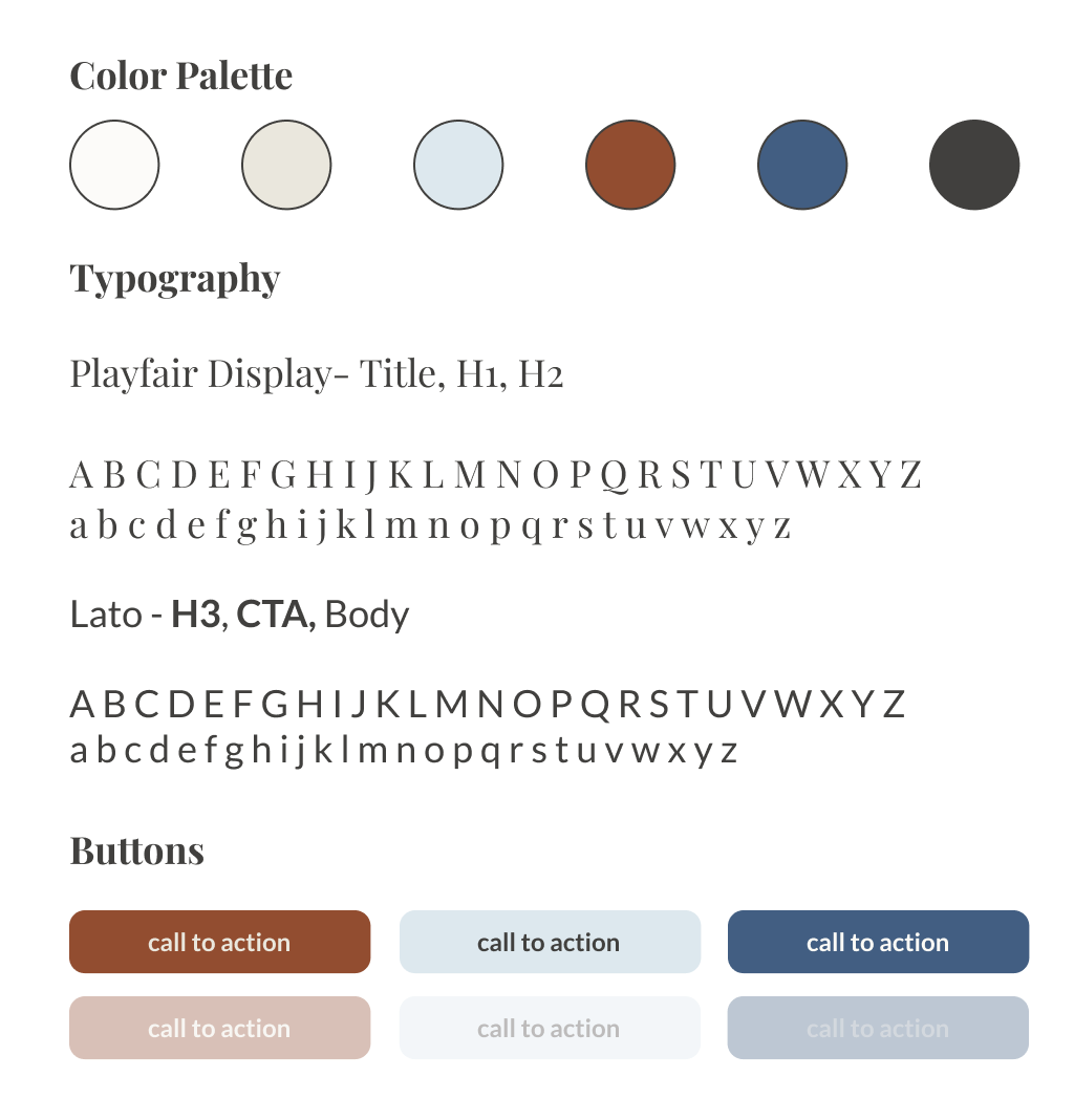
Branding & Logo


04 Prototype + Testing
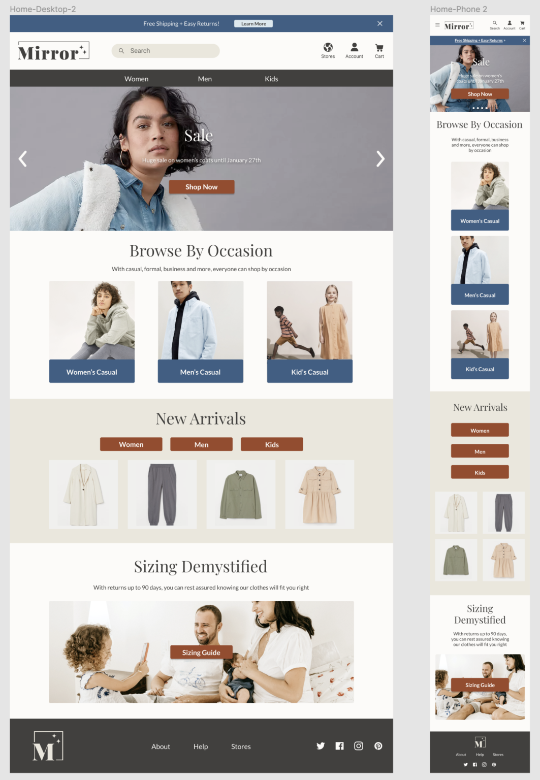
High Fidelity Design
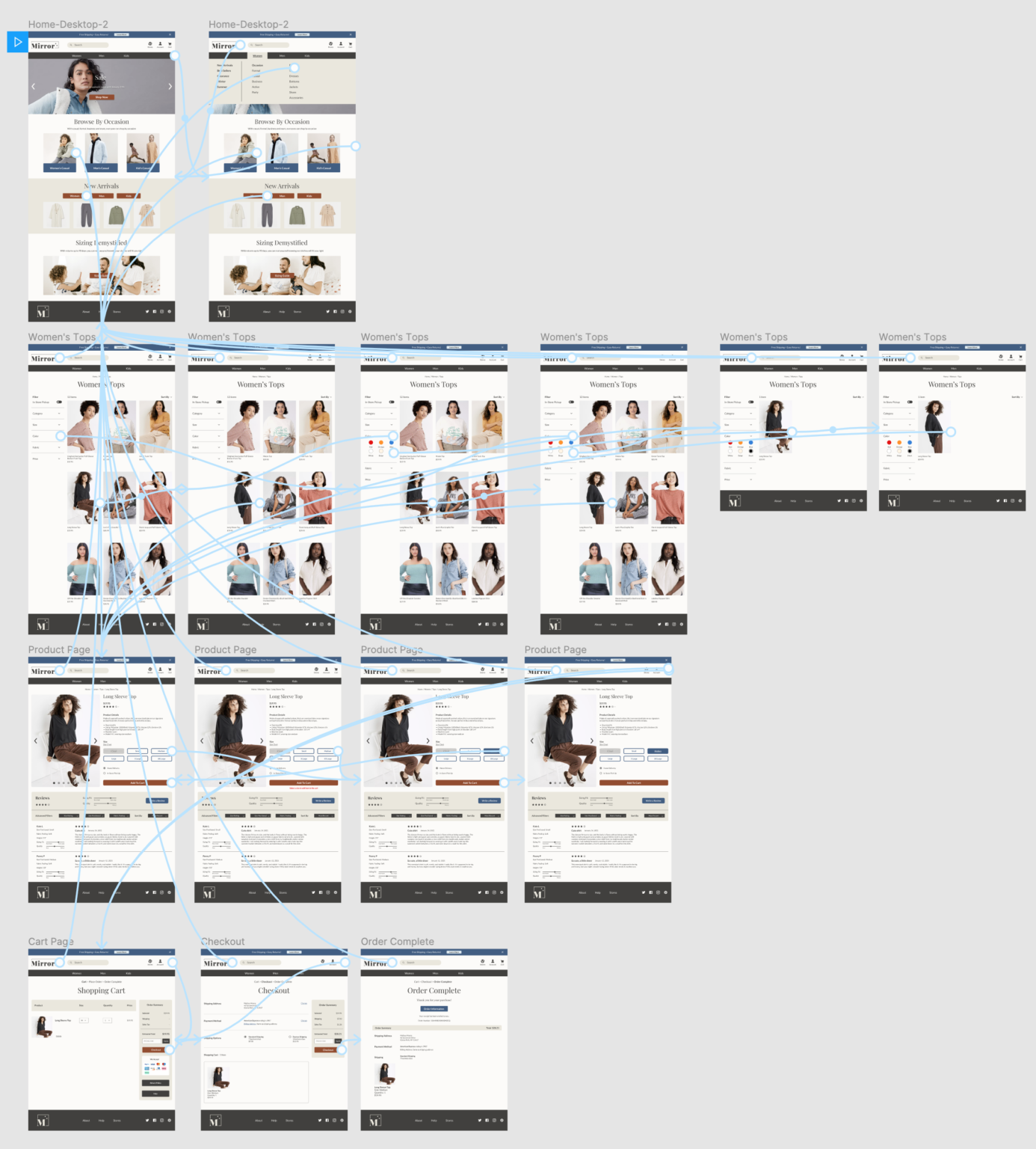
Usability Testing
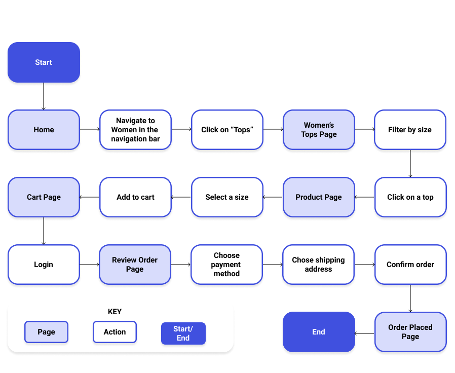
When testing the website, I wanted to see the ease of completing the task, if the colors and call-to-actions caught user’s eye, and see where users run into errors. I recruited three participants to go over the prototype with me over Zoom where I was able to ask them to accomplish the task of purchasing an item and ask them questions throughout.
The usability test objectives were:
- Observe how users complete primary end-to-end flow culminating in the purchase of an item
- Test overall ease of navigation
- Test how easy it is for users to locate specific categories
- Test if colors attract users eye with the specific CTAs
- Observe where users run into errors, issues, or confusion
Affinity Map
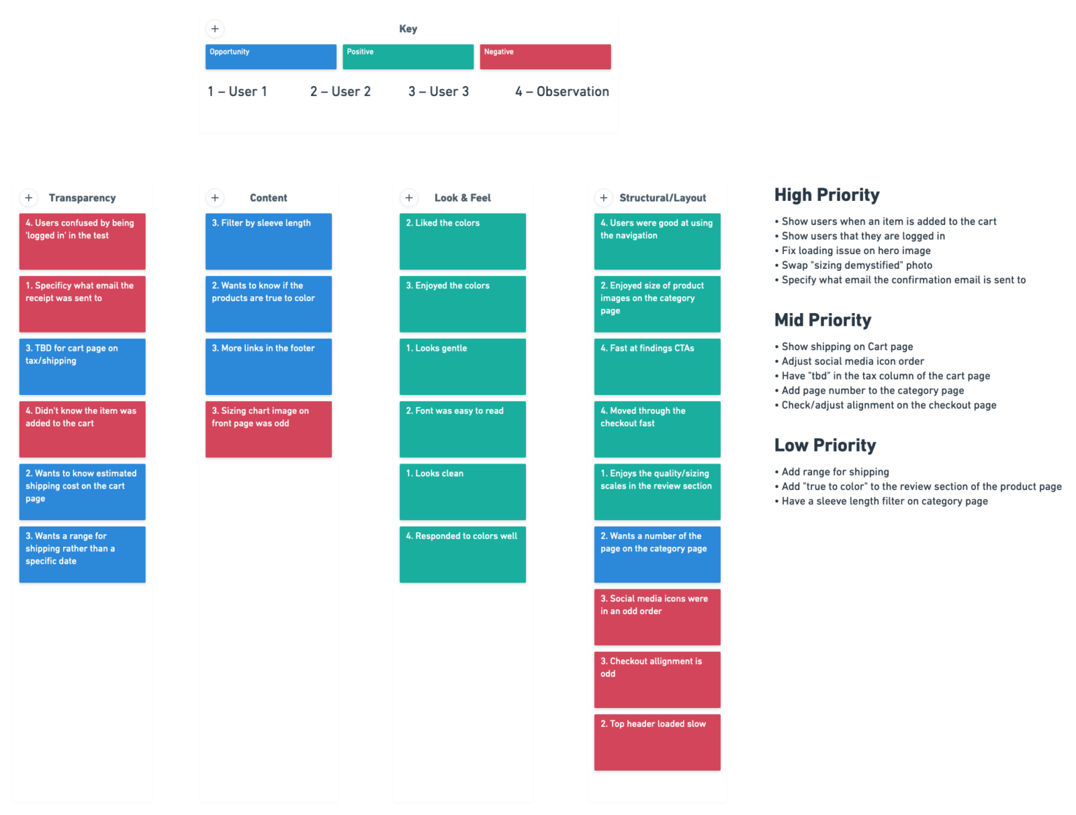
Once testing was complete, I created an affinity map with the notes from the test. Color coding the notes allowed me to know at a glance understand where to prioritize my time.
Some of the key findings from these tests were:
- Brand colors were effective
- Navigated through the site effectively
- Users clicked on CTAs fast
- Users moved through checkout fast
- Described the website with words like “gentle” and “clean”
- Users had trouble knowing if items were added to the cart
- Users didn’t know they were ‘logged in’
Outcome
Next Steps
Given more time I would:
- Test responsive site
- Create a login page and test the process
- Do further research into what user’s are looking for in terms of sizing
What I Learned Along The Way
Research is foundational
As my first full UX project, I learned the importance of doing proper research. User interviews proved to be some of the most helpful information I carried throughout the whole design.
Limited time doesn’t have to mean limited data
I would have spent more time conducting different types of research, such as surveys. I also wish I did a combination of online user testing as well as my Zoom based user testing. Since I had limited time to complete the project, it would have helped me to have more qualitative data.
Acknowledging assumptions is essential
Throughout this whole process, I had my own preconceived ideas about how a clothing retailers site should look, how people should interact, and the features it should have. When I took a step back and asked myself “why” I was doing a lot of things, the answer was coming back to, “it’s what I am used to seeing or doing myself.” A huge example of this was when it came to dealing with the pain point of sizing. As a straight sized individual, I have not had to worry about sizing the same way many others have. Reminding myself that my assumptions are just assumptions helped me get out of my own head and empathize more.


